Case Study: The Chock Shop
Company
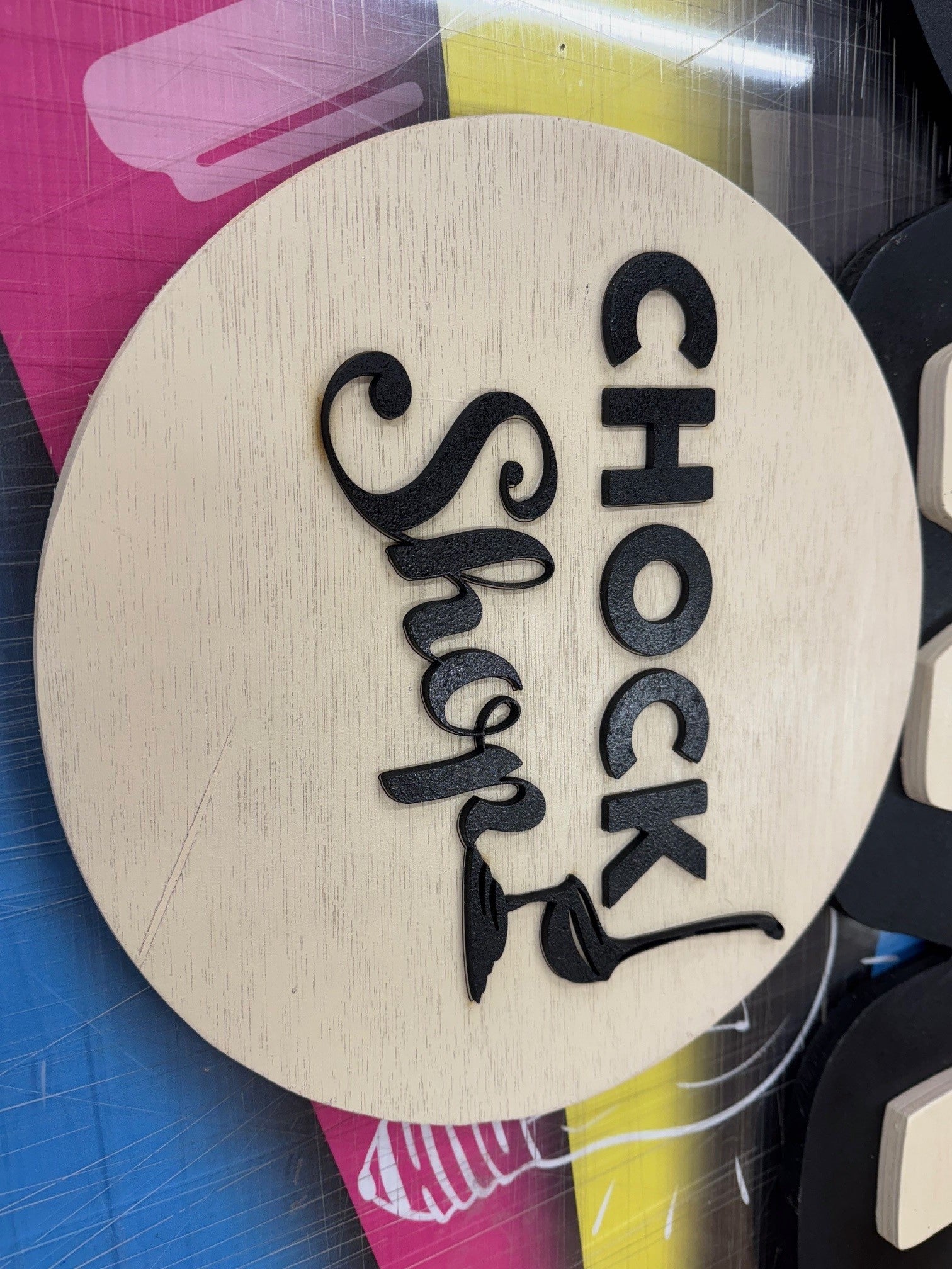
The Chock Shop
Location
UK
Industry
Food & Beverage / Artisan Desserts / Festival Catering
Client Background
Project Objectives
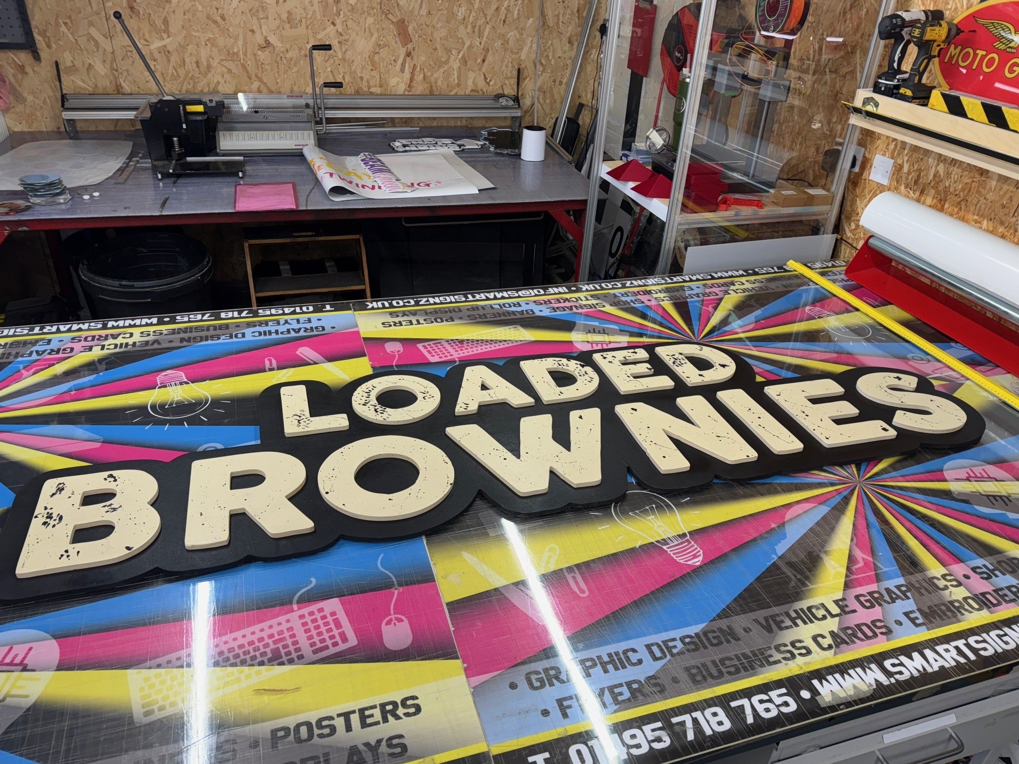
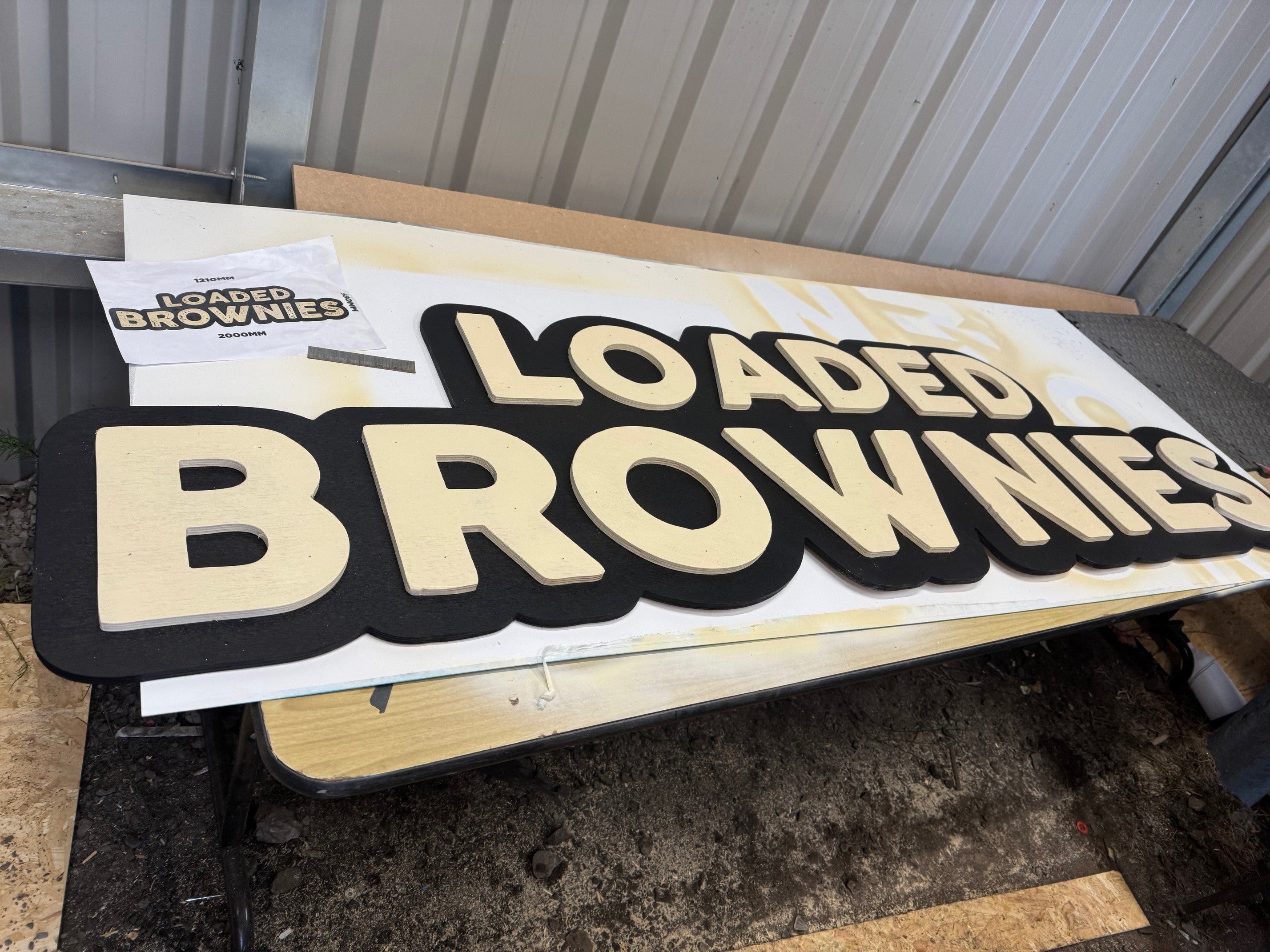
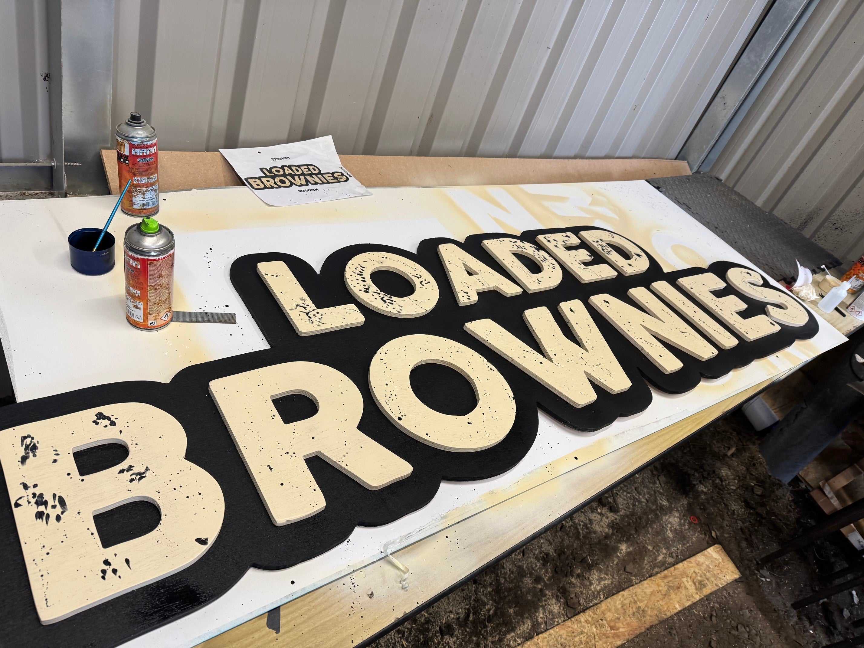
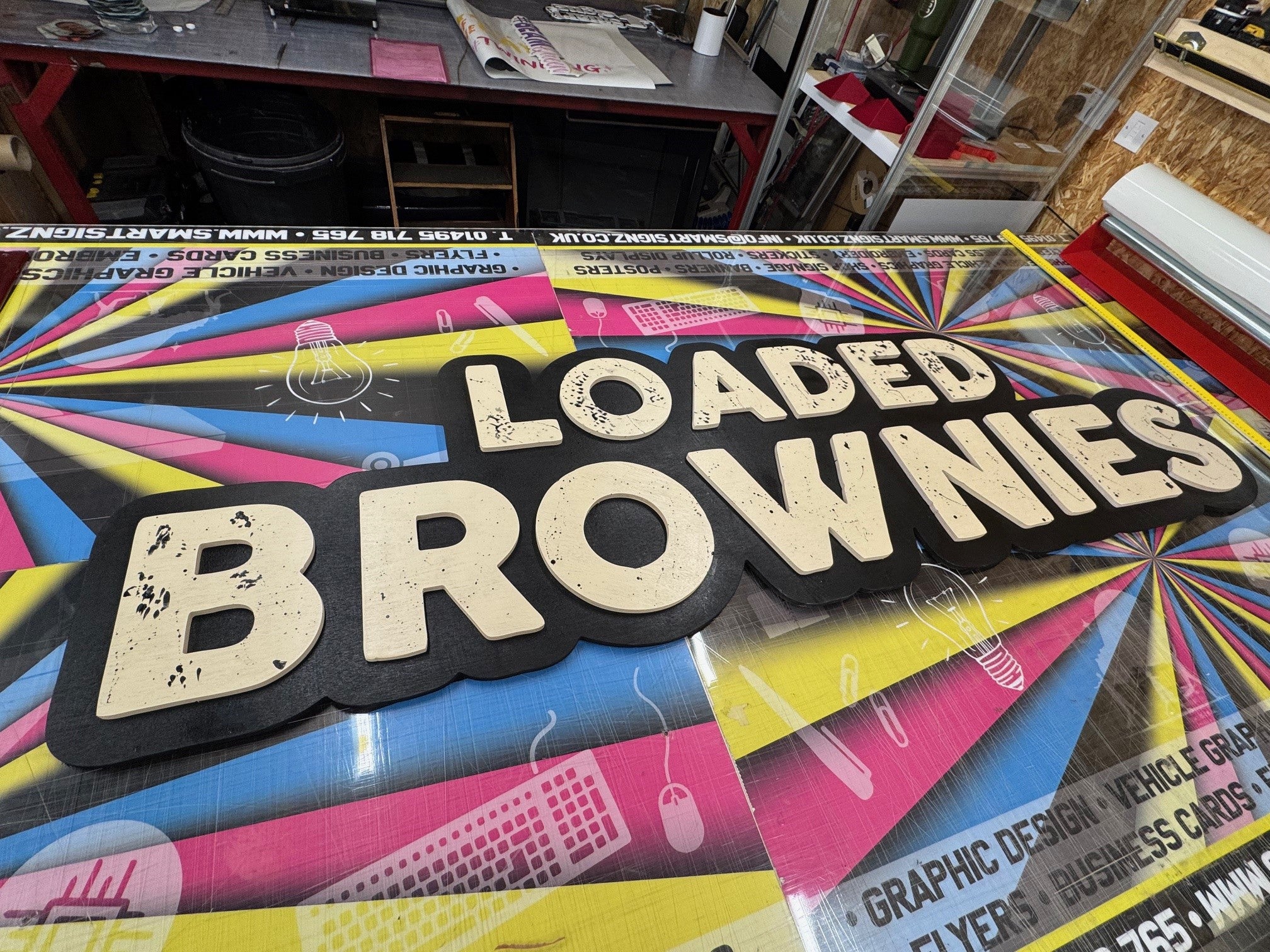
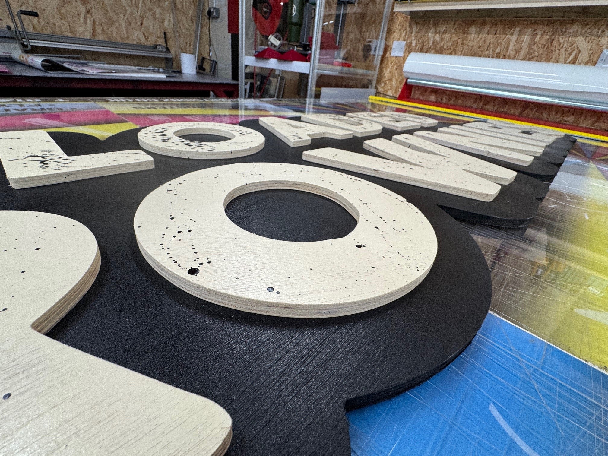
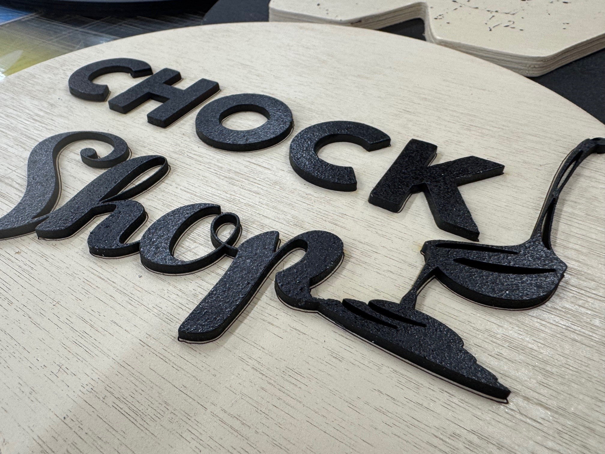
Design and Production
Challenges and Solutions
Outcome and Impact
Feedback
Gallery